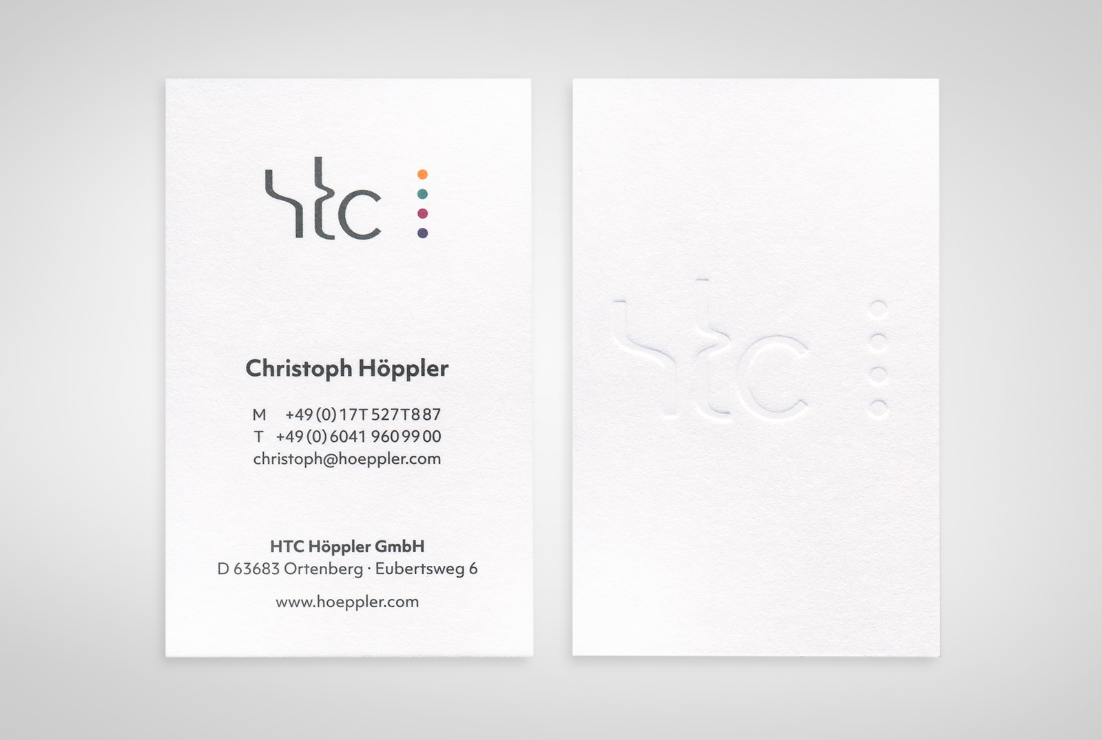
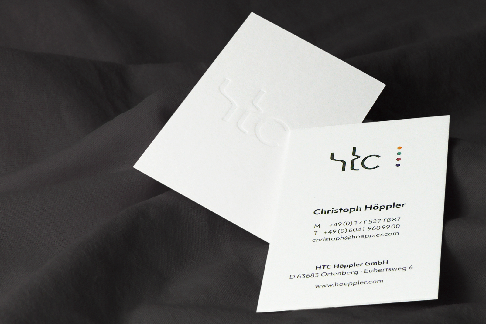
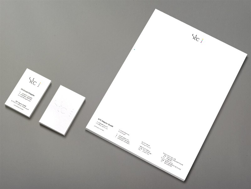
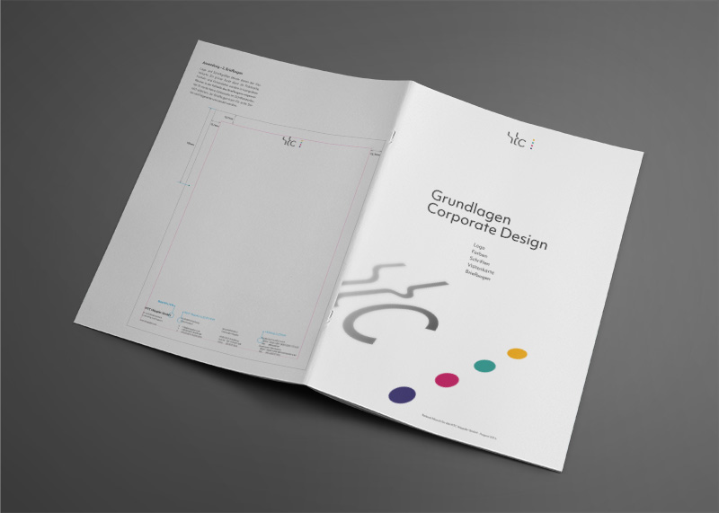
HTC Höppler GmbH


HTC Höppler GmbH is active in the sale and support of high-end IT solutions and media systems.

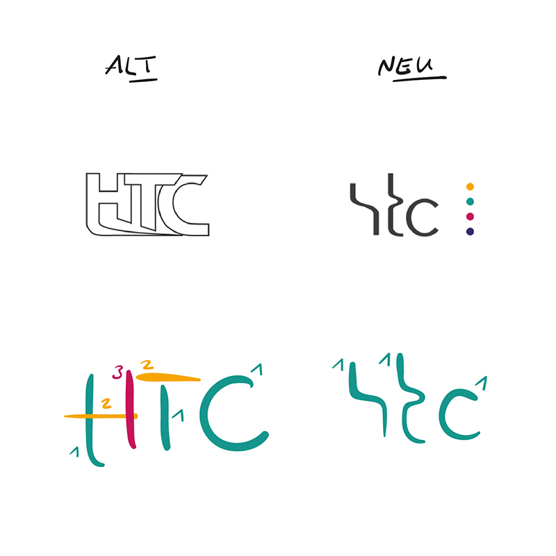
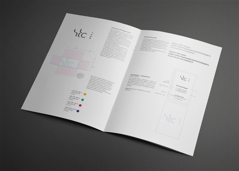
The premise was that the logo of a company in this sector should not look cumbersome under any circumstances. Reliability, convenience and trustworthiness are decisive for both the cooperation with HTC Höppler GmbH and for working with the technology it provides. The three letters of the logo were modified accordingly.

As few gestures as possible

A capital "H" consists of three gestures, a capital "T" of two gestures and a capital "C" of one. In order to declutter the logo and make it more relaxed and airy, the letters have now been modified so that they each consist of just one gesture. Furthermore, acute angles, i.e. turning points in the gesture, were avoided.

Stationery

A dot is also used as a fold mark on the letterhead.
The results of the work were also documented in a small style guide.
Previous Project
Nächstes Projekt